Monochrome Magic: The Benefits of Using Black and White Prints
Black and white artwork combines simplicity with sophistication. It often speaks to us more deeply, has greater resonance, and conveys the topic better than its coloured counterpart. Our eternal obsession with these pieces endures to this day and many people see them as more artistic and imaginative.
Transform your living space into a captivating gallery with these modern monochrome prints made in Australia. They transcend the ordinary and add a touch of contemporary flair to your home decor. Whether you seek a statement piece for your living room or a subtle accent for your bedroom, these pieces offer a versatile and chic solution to elevate any room. Let’s unravel the secrets behind the question – Why are black and white pictures better?
Highlights the Composition

Restricting the colour scheme of an artwork turns the composition into a focal point of the entire piece. Instead of the colour, the structure of the forms and patterns directs the spectator’s gaze, which controls how the viewer perceives the piece. Proof of this occurrence are artists who produce art in both multi-coloured and monochrome styles.
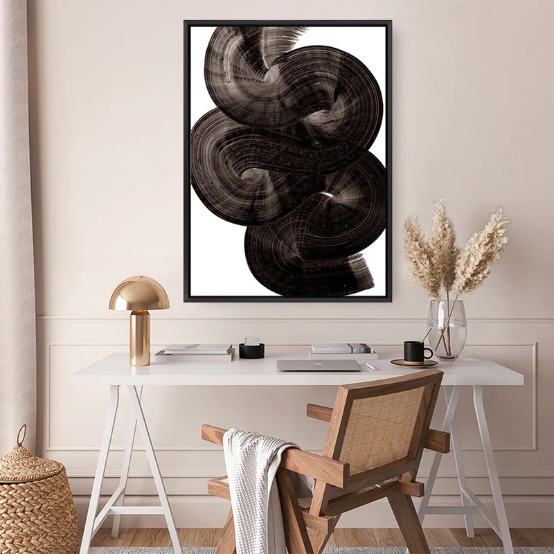
The intertwining strategically placed lines and squiggles appear to be expanding like a living thing as they stretch across the print. Without the distraction of a vibrant palette, these pieces call viewers to explore the nuanced symphony of shadows and highlights. Every stroke, contour, and detail is brought to the forefront, revealing the artist’s craftsmanship in a way that feels remarkably alive.
Looks Simple Yet Eye-Catching
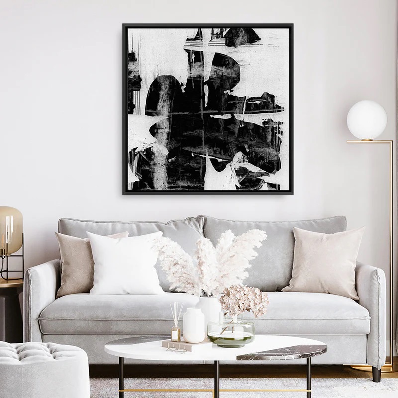
The simplicity of black and white art prints is a testament to the power of expression. Stripped of other hues, the essence of the subject is laid bare, inviting viewers to engage with the raw, unembellished core of the artist’s vision. It’s a visual language that speaks volumes with minimalism, where each shade of grey becomes a nuanced brushstroke in a narrative that unfolds with clarity.
The stark interaction of shadows and light creates a dramatic tension that captures attention and holds it so that the viewer can immerse themselves in the depth of the piece. This duality of simplicity and impact is what renders these pieces not merely decorative elements but profound statements within a space.
The hallway is a transitional space often overlooked in terms of its artistic potential. Here, the simplicity of monochrome pieces finds a purpose, transforming the space into a gallery of visual intrigue. The lack of colour distractions allows for a seamless integration of these impactful pieces, turning the space into a curated journey through the artist’s perspective.
Makes the Space Appear Bigger
The timeless elegance of monochrome prints extends beyond aesthetics. One compelling reason why many people hang them on their walls is their unique ability to make a space appear larger and more expansive. In the absence of a vibrant colour palette, these pieces create a visual continuity that seamlessly integrates with the surroundings. This cohesion eliminates the visual disruptions that colours can introduce, which allows the eye to move freely across the space without interruption. The result is a harmonious flow that imparts an illusion of openness.
The simplicity of black and white prints inherently reduces visual clutter and creates a sense of airiness and expansiveness. Whether adorning the walls of a cosy living room or gracing the corridors of a compact hallway, these prints play a visual trick that opens the boundaries of a room.
Moreover, the contrast in these pieces introduces a dynamic element that draws the eye into the details of the artwork rather than the confines of the space. This visual depth tricks the mind into perceiving a larger expanse, transforming even smaller rooms into areas that exude a sense of grandeur.
Conveys Emotion

The absence of colour becomes a canvas for evoking profound emotions. One striking aspect of black and white prints lies in their ability to draw the viewer’s attention to subtle details that are otherwise often overshadowed in a colourful composition. The play of shadows and light takes centre stage and accentuates the intricacies of facial expressions, the lines etched by time, and the subtle nuances that convey emotions with intensity.
The simplicity of these pieces, far from being a limitation, becomes a powerful tool for storytelling. In stripping away the distraction of colour, these prints invite the observer to engage with the raw, unfiltered essence of the subject. Wrinkles become narratives of a life well-lived, and expressions become windows into the soul. These details foster a connection that transcends the visual and taps into the reservoir of shared human experiences.
Draws Attention to the Message
The absence of colour distractions is also often a strategic decision that allows viewers to immerse themselves wholly in the thematic essence of the artwork. Whether conveying a powerful social commentary, encapsulating a moment of raw emotion, or exploring abstract concepts, the absence of colour acts as a visual decluttering. In doing so, it amplifies the impact of the intended message.
In monochrome art, form, texture, and composition become the storytellers. The deliberate play of shadows and highlights, the crispness of lines, and the nuances of contrast work cohesively to underline the central theme. The viewer’s gaze is not diverted by a spectrum of colours; instead, these pieces guide it towards the heart of the narrative, fostering a connection that transcends the visual.


